Card
<terra-card> | TerraCard
Cards can be used to group related subjects in a container.
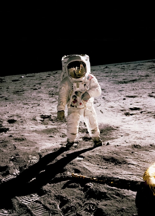 Artemis Mission
NASA’s Artemis program will land the first woman and first person of color on the Moon, using innovative technologies to explore more of the lunar surface than ever before.
Published 2 hours ago
<terra-card class="card-overview" style="max-width: 300px;">
  <img
    slot="image"
    src="https://images.unsplash.com/photo-1541873676-a18131494184?w=500"
    alt="NASA astronaut in spacesuit"
  />

  <strong>Artemis Mission</strong><br />
  NASA's Artemis program will land the first woman and first person of color on the Moon, using innovative technologies to explore more of the lunar surface than ever before.<br />
  <small style="color: var(--terra-color-carbon-60);">Published 2 hours ago</small>

  <div slot="footer" style="display: flex; justify-content: space-between; align-items: center;">
    <terra-button variant="primary" pill>Learn More</terra-button>
  </div>
</terra-card>
Examples
Basic Card
Basic cards aren’t very exciting, but they can display any content you want them to.
<terra-card class="card-basic" style="max-width: 300px;">
  Lorem ipsum dolor sit amet, consectetur adipiscing elit. Sed do eiusmod tempor incididunt ut labore et dolore magna aliqua.
</terra-card>
Card with Header
Headers can be used to display titles and more.
Mission Overview
<terra-card class="card-header" style="max-width: 300px;">
  <div slot="header" style="display: flex; align-items: center; justify-content: space-between;">
    <h3 style="margin: 0;">Mission Overview</h3>
    <terra-icon name="outline-cog-6-tooth" library="heroicons"></terra-icon>
  </div>

  Ut enim ad minim veniam, quis nostrud exercitation ullamco laboris nisi ut aliquip ex ea commodo consequat.
</terra-card>
Card with Footer
Footers can be used to display actions, summaries, or other relevant content.
<terra-card class="card-footer" style="max-width: 300px;">
  Duis aute irure dolor in reprehenderit in voluptate velit esse cillum dolore eu fugiat nulla pariatur.

  <div slot="footer" style="display: flex; justify-content: space-between; align-items: center;">
    <terra-button variant="primary">View Details</terra-button>
  </div>
</terra-card>
Images
Cards accept an image slot. The image is displayed atop the card and stretches to fit.
 Excepteur sint occaecat cupidatat non proident, sunt in culpa qui officia deserunt mollit anim id
est laborum.
Excepteur sint occaecat cupidatat non proident, sunt in culpa qui officia deserunt mollit anim id
est laborum.
<terra-card class="card-image" style="max-width: 300px;">
  <img
    slot="image"
    src="https://images.unsplash.com/photo-1541873676-a18131494184?w=400"
    alt="NASA astronaut in spacesuit at Johnson Space Center"
  />
  Excepteur sint occaecat cupidatat non proident, sunt in culpa qui officia deserunt mollit anim id est laborum.
</terra-card>
Complete Card
Cards can include all slots together: image, header, body, and footer.
Published 5 hours ago
<terra-card class="card-complete" style="max-width: 300px;">
  <img
    slot="image"
    src="https://images.unsplash.com/photo-1541873676-a18131494184?w=500"
    alt="NASA astronaut in spacesuit"
  />

  <div slot="header">
    <strong>International Space Station</strong>
  </div>

  The International Space Station serves as a microgravity laboratory where crew members conduct experiments across multiple fields of research.<br />
  <small style="color: var(--terra-color-carbon-60);">Published 5 hours ago</small>

  <div slot="footer" style="display: flex; justify-content: space-between; align-items: center;">
    <terra-button variant="primary" pill>Read More</terra-button>
  </div>
</terra-card>
Custom Styling
You can customize cards using CSS custom properties.
<terra-card style="--border-color: var(--terra-color-nasa-blue); --border-width: 2px; --padding: 2rem; max-width: 300px;">
  This card has custom border color, width, and padding.
</terra-card>
[component-metadata:terra-card]
Importing
If you’re using the autoloader or the traditional loader, you can ignore this section. Otherwise, feel free to use any of the following snippets to cherry pick this component.
To import this component from the CDN using a script tag:
<script type="module" src="https://cdn.jsdelivr.net/npm/@nasa-terra/components@0.0.138/cdn/components/card/card.js"></script>
To import this component from the CDN using a JavaScript import:
import 'https://cdn.jsdelivr.net/npm/@nasa-terra/components@0.0.138/cdn/components/card/card.js';
To import this component using a bundler:
import '@nasa-terra/components/dist/components/card/card.js';
To import this component as a React component:
import TerraCard from '@nasa-terra/components/dist/react/card';
Slots
| Name | Description |
|---|---|
| (default) | The card’s main content. |
header
|
An optional header for the card. |
footer
|
An optional footer for the card. |
image
|
An optional image to render at the start of the card. |
Learn more about using slots.
Custom Properties
| Name | Description | Default |
|---|---|---|
--border-color
|
The card’s border color, including borders that occur inside the card. | |
--border-radius
|
The border radius for the card’s edges. | |
--border-width
|
The width of the card’s borders. | |
--padding
|
The padding to use for the card’s sections. |
Learn more about customizing CSS custom properties.
Parts
| Name | Description |
|---|---|
base
|
The component’s base wrapper. |
image
|
The container that wraps the card’s image. |
header
|
The container that wraps the card’s header. |
body
|
The container that wraps the card’s main content. |
footer
|
The container that wraps the card’s footer. |
Learn more about customizing CSS parts.