Tooltip
<terra-tooltip> | TerraTooltip
Tooltips display brief, contextual help on hover or focus. Popovers show richer supporting content.
Tooltip
Tooltips display informative text when users hover or focus on an element. They are best suited for short, inline help in dense UIs.
- The tooltip’s target is its first child element, so you should only wrap one element inside each tooltip. If you need a tooltip for multiple elements, wrap them in a container and apply the tooltip to that container.
-
terra-tooltipusesdisplay: contents, so it won’t affect layout in flex or grid containers.
<terra-tooltip content="More information about this action">
  <terra-button>Hover or focus me</terra-button>
</terra-tooltip>
Placement
Use the placement attribute to set the preferred placement of the tooltip.
<div class="tooltip-placement-example">
  <div class="tooltip-placement-example-row">
    <terra-tooltip content="top-start" placement="top-start">
      <terra-button></terra-button>
    </terra-tooltip>
    <terra-tooltip content="top" placement="top">
      <terra-button></terra-button>
    </terra-tooltip>
    <terra-tooltip content="top-end" placement="top-end">
      <terra-button></terra-button>
    </terra-tooltip>
  </div>

  <div class="tooltip-placement-example-row">
    <terra-tooltip content="left-start" placement="left-start">
      <terra-button></terra-button>
    </terra-tooltip>
    <terra-tooltip content="right-start" placement="right-start">
      <terra-button></terra-button>
    </terra-tooltip>
  </div>

  <div class="tooltip-placement-example-row">
    <terra-tooltip content="left" placement="left">
      <terra-button></terra-button>
    </terra-tooltip>
    <terra-tooltip content="right" placement="right">
      <terra-button></terra-button>
    </terra-tooltip>
  </div>

  <div class="tooltip-placement-example-row">
    <terra-tooltip content="left-end" placement="left-end">
      <terra-button></terra-button>
    </terra-tooltip>
    <terra-tooltip content="right-end" placement="right-end">
      <terra-button></terra-button>
    </terra-tooltip>
  </div>

  <div class="tooltip-placement-example-row">
    <terra-tooltip content="bottom-start" placement="bottom-start">
      <terra-button></terra-button>
    </terra-tooltip>
    <terra-tooltip content="bottom" placement="bottom">
      <terra-button></terra-button>
    </terra-tooltip>
    <terra-tooltip content="bottom-end" placement="bottom-end">
      <terra-button></terra-button>
    </terra-tooltip>
  </div>
</div>

<style>
  .tooltip-placement-example {
    width: 250px;
    margin: 1rem;
  }

  .tooltip-placement-example-row::after {
    content: '';
    display: table;
    clear: both;
  }

  .tooltip-placement-example terra-button {
    float: left;
    width: 2.5rem;
    margin-right: 0.25rem;
    margin-bottom: 0.25rem;
  }

  .tooltip-placement-example-row:nth-child(1) terra-tooltip:first-child terra-button,
  .tooltip-placement-example-row:nth-child(5) terra-tooltip:first-child terra-button {
    margin-left: calc(40px + 0.25rem);
  }

  .tooltip-placement-example-row:nth-child(2) terra-tooltip:nth-child(2) terra-button,
  .tooltip-placement-example-row:nth-child(3) terra-tooltip:nth-child(2) terra-button,
  .tooltip-placement-example-row:nth-child(4) terra-tooltip:nth-child(2) terra-button {
    margin-left: calc((40px * 3) + (0.25rem * 3));
  }
</style>
Click trigger
Set the trigger attribute to click to toggle the tooltip on click instead of
hover.
<terra-tooltip content="Click again to dismiss" trigger="click">
  <terra-button>Click to toggle</terra-button>
</terra-tooltip>
Manual trigger
Tooltips can be controlled programmatically by setting the trigger attribute to
manual. Use the open property to control when the tooltip is shown.
<terra-button id="tooltip-toggle" style="margin-right: 4rem;">Toggle manually</terra-button>

<terra-tooltip
  id="manual-tooltip"
  content="This is an avatar"
  trigger="manual"
  style="vertical-align: middle;"
>
  <terra-avatar initials="AB"></terra-avatar>
</terra-tooltip>

<script type="module">
  const tooltip = document.querySelector('#manual-tooltip');
  const toggle = document.querySelector('#tooltip-toggle');

  toggle.addEventListener('click', () => {
    tooltip.open = !tooltip.open;
  });
</script>
Removing arrows
You can control the size of tooltip arrows by overriding the
--terra-tooltip-arrow-size design token. To remove them, set the value to 0 as
shown below.
<terra-tooltip content="This is a tooltip" style="--terra-tooltip-arrow-size: 0;">
  <terra-button>No arrow</terra-button>
</terra-tooltip>
To override it globally, set it in a root block in your stylesheet:
:root {
    --terra-tooltip-arrow-size: 0;
}
HTML in tooltips
Use the content slot to create tooltips with HTML content. Tooltips are designed only for
text and presentational elements. Avoid placing interactive content such as buttons,
links, and form controls in a tooltip; use a popover instead.
<terra-tooltip>
  <div slot="content">
    I'm not <strong>just</strong> a tooltip, I'm a <em>tooltip</em> with HTML!
  </div>
  <terra-button>Hover me</terra-button>
</terra-tooltip>
Maximum width
Use the --max-width custom property to change how wide a tooltip can grow before wrapping.
<terra-tooltip
  style="--max-width: 80px;"
  content="This tooltip will wrap after only 80 pixels."
>
  <terra-button>Hover me</terra-button>
</terra-tooltip>
Hoisting
Tooltips will be clipped if they’re inside a container that has overflow: auto|hidden|scroll.
The hoist attribute forces the tooltip to use a fixed positioning strategy, allowing it to
break out of the container.
<div class="tooltip-hoist">
  <terra-tooltip content="This is a tooltip">
    <terra-button>No hoist</terra-button>
  </terra-tooltip>

  <terra-tooltip content="This is a tooltip" hoist>
    <terra-button>Hoist</terra-button>
  </terra-tooltip>
</div>

<style>
  .tooltip-hoist {
    position: relative;
    border: solid 2px var(--terra-panel-border-color);
    overflow: hidden;
    padding: var(--terra-spacing-medium);
  }
</style>
Popover
Popovers are larger panels that can contain additional text, images, or links. Use a popover when you need more supporting content than a tooltip can provide, or when you need interactive content such as “Learn more” links.
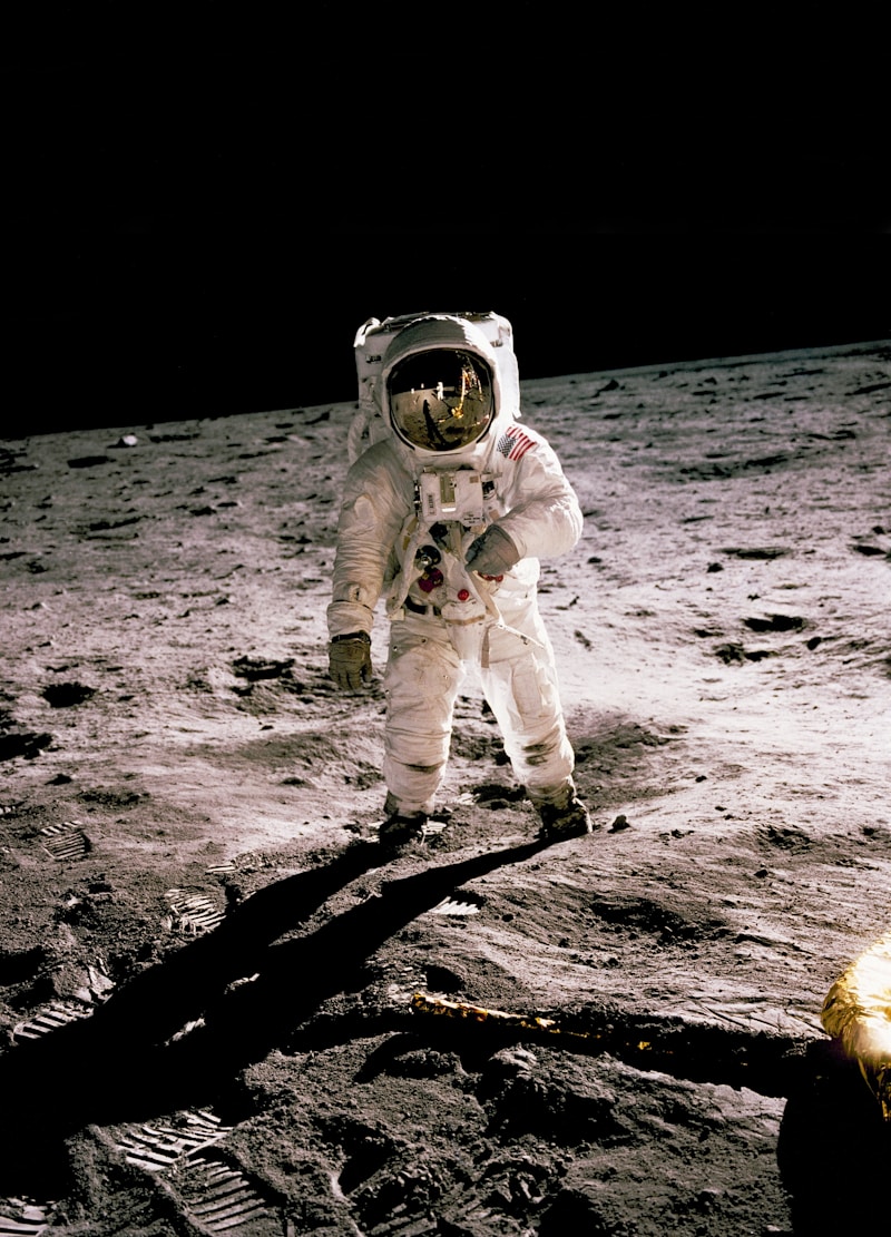
Astronaut Candidate Kayla Barron
NASA astronaut candidate Kayla Barron is seen after donning her spacesuit at NASA’s Johnson Space Center in Houston, Texas.
Credits: NASA/Bill Ingalls
More Details<terra-tooltip variant="popover" trigger="click"> <terra-button>More Details</terra-button> <img slot="image" src="https://images.unsplash.com/photo-1541873676-a18131494184?w=800" alt="Astronaut" > <div slot="content"> <h3 style="margin-top: 0; margin-bottom: 0.5rem;">Astronaut Candidate Kayla Barron</h3> <p style="margin: 0 0 0.5rem;"> NASA astronaut candidate Kayla Barron is seen after donning her spacesuit at NASA's Johnson Space Center in Houston, Texas. </p> <p style="margin: 0 0 0.75rem;"><strong>Credits:</strong> NASA/Bill Ingalls</p> <a href="#" style="font-weight: 600; text-decoration: underline dotted;">More Details</a> </div> </terra-tooltip>
[component-metadata:terra-tooltip]
Importing
If you’re using the autoloader or the traditional loader, you can ignore this section. Otherwise, feel free to use any of the following snippets to cherry pick this component.
To import this component from the CDN using a script tag:
<script type="module" src="https://cdn.jsdelivr.net/npm/@nasa-terra/components@0.0.138/cdn/components/tooltip/tooltip.js"></script>
To import this component from the CDN using a JavaScript import:
import 'https://cdn.jsdelivr.net/npm/@nasa-terra/components@0.0.138/cdn/components/tooltip/tooltip.js';
To import this component using a bundler:
import '@nasa-terra/components/dist/components/tooltip/tooltip.js';
To import this component as a React component:
import TerraTooltip from '@nasa-terra/components/dist/react/tooltip';
Slots
| Name | Description |
|---|---|
| (default) | The tooltip or popover target element. Avoid slotting in more than one element, as subsequent ones will be ignored. |
content
|
The content to render in the tooltip or popover. Alternatively, you can use the
content attribute.
|
image
|
Optional image slot for popovers. When provided, the image will span the full width of the popover. |
Learn more about using slots.
Properties
| Name | Description | Reflects | Type | Default |
|---|---|---|---|---|
content
|
The tooltip or popover content. If you need to display HTML, use the content slot
instead.
|
string
|
''
|
|
variant
|
The variant of the component. tooltip shows compact inline help, while
popover shows a larger card-style panel that can contain images and links.
|
|
'tooltip' | 'popover'
|
'tooltip'
|
placement
|
The preferred placement of the tooltip. Note that the actual placement may vary as needed to keep the tooltip inside of the viewport. |
                        'top' | 'top-start' | 'top-end' | 'right' | 'right-start' | 'right-end' | 'bottom' |
                        'bottom-start' | 'bottom-end' | 'left' | 'left-start' | 'left-end'
|
'top'
|
|
disabled
|
Disables the tooltip so it won’t show when triggered. |
|
boolean
|
false
|
distance
|
The distance in pixels from which to offset the tooltip or popover away from its target. |
number
|
8
|
|
open
|
Indicates whether or not the tooltip or popover is open. You can use this in lieu of the show/hide methods. |
|
boolean
|
false
|
skidding
|
The distance in pixels from which to offset the tooltip along its target. |
number
|
0
|
|
trigger
|
Controls how the tooltip or popover is activated. Possible options include click,
hover, focus, and manual. Multiple options can be passed by
separating them with a space. When manual is used, the tooltip must be activated programmatically.
|
string
|
'hover focus'
|
|
hoist
|
Enable this option to prevent the tooltip from being clipped when the component is placed inside a
container with
overflow: auto|hidden|scroll. Hoisting uses a fixed positioning strategy that works
in many, but not all, scenarios.
|
boolean
|
false
|
|
updateComplete
|
A read-only promise that resolves when the component has finished updating. |
Learn more about attributes and properties.
Events
| Name | React Event | Description | Event Detail |
|---|---|---|---|
terra-show
|
onTerraShow
|
Emitted when the tooltip or popover begins to show. | - |
terra-after-show
|
onTerraAfterShow
|
Emitted after it has shown and all animations are complete. | - |
terra-hide
|
onTerraHide
|
Emitted when the tooltip or popover begins to hide. | - |
terra-after-hide
|
onTerraAfterHide
|
Emitted after it has hidden and all animations are complete. | - |
Learn more about events.
Methods
| Name | Description | Arguments |
|---|---|---|
show()
|
Shows the tooltip or popover. | - |
hide()
|
Hides the tooltip or popover. | - |
Learn more about methods.
Custom Properties
| Name | Description | Default |
|---|---|---|
--max-width
|
The maximum width of the tooltip before its content will wrap. | |
--hide-delay
|
The amount of time to wait before hiding the tooltip when hovering. | |
--show-delay
|
The amount of time to wait before showing the tooltip when hovering. |
Learn more about customizing CSS custom properties.
Parts
| Name | Description |
|---|---|
base
|
The component’s base wrapper, an <terra-popup> element. |
base__popup
|
The popup’s exported popup part. Use this to target the tooltip’s popup container.
|
base__arrow
|
The popup’s exported arrow part. Use this to target the tooltip’s arrow. |
body
|
The tooltip or popover body where its content is rendered. |
Learn more about customizing CSS parts.
Animations
| Name | Description |
|---|---|
tooltip.show
|
The animation to use when showing the tooltip. |
tooltip.hide
|
The animation to use when hiding the tooltip. |
Learn more about customizing animations.
Dependencies
This component automatically imports the following dependencies.
-
<terra-popup>